Open Visual CSS QuickMenu
Visual CSS QuickMenu is a program that lets the user build sophisticated menus without having extensive knowledge about computer programming. QuickMenu is product offered by OpenCube and can be purchased at www.opencube.com.
The menus used in all of the MHS web sites were created using QuickMenu.
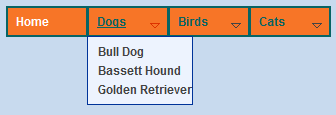
Below is a sample menu created using QuickMenu with the Bump Subs option enabled. Try it out.
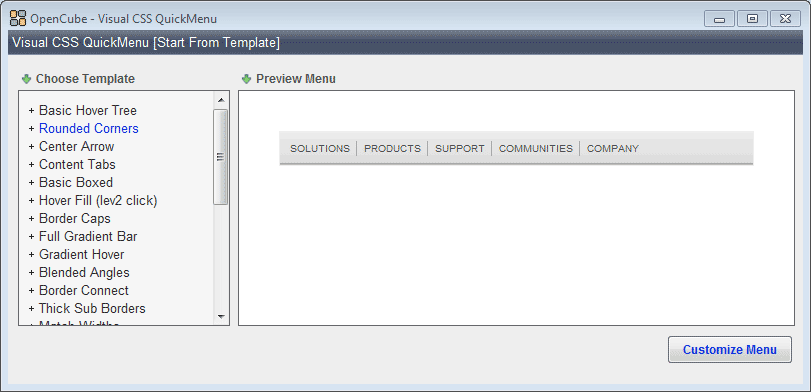 Navigate to the Applications folder found on the computer's desktop. Open Visual CSS QuickMenu. Navigate to the Applications folder found on the computer's desktop. Open Visual CSS QuickMenu.
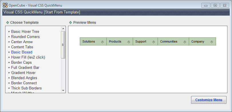 From the left choose a template style. From the left choose a template style.
Each menu template has characteristics, color and font size to name a couple, that can be modified. Pressing the plus sign will open a templates modification area.
Pressing a minus sign will close an area.
Feel free at this point to view the available templates.
For this demonstration we’ll select Basic Boxed.
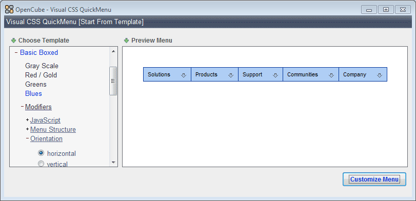 Select a color scheme for the template. Select a color scheme for the template.
We will use Blues for this demonstration.
Notice: if needed any of the colors can be changed at a later time.
 Make the following modifications to the menu: Make the following modifications to the menu:
- In the Modifiers area under Menu Structure choose the starter option.
- Under Sub Effects select one of the available options. Pass the mouse over the menu to see the effects in action. For this demonstration bump will be selected. This option can be changed later if desired.
- Under Show Sub Delay select normal (please test the others to see the effect in action)
- Under Arrow Types select arrow (please test the others to see the differences)
- Now that you have selected a menu style and made some simple modifications press the Customize Menu button found in the bottom-right corner.
 QuickMenu is not a free program. McFarland Schools paid a fee so that the menus created in class could be used on a web server without a warning message appearing that states the menu has not been paid for. NOTICE: The unlock code supplied below is only valid on the hs-web-class server. QuickMenu is not a free program. McFarland Schools paid a fee so that the menus created in class could be used on a web server without a warning message appearing that states the menu has not been paid for. NOTICE: The unlock code supplied below is only valid on the hs-web-class server.
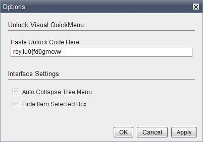
- To unlock the QuickMenu code, select Unlock from the Help menu. Copy and then paste the following code in the ‘Unlock Code’ field.
roy:iu0{fd0gmcvw
- Press the OK button on the dialog box. You will receive a message indicating that the software has been successfully unlocked. Press OK.
- In Visual CSS QuickMenu choose Save from the File menu . Saving the menu allows you to open it again at a later time to make changes.
- Navigate to the folder on the (I): drive that contains your project .
- Give your file an appropriately descriptive name. For example, animal_menu.html would be acceptable for a site about animals.
Alert: Saving the file does not change anything on the web site. You will need to publish (discussed in the next lesson) the menu for it to appear on the web site.
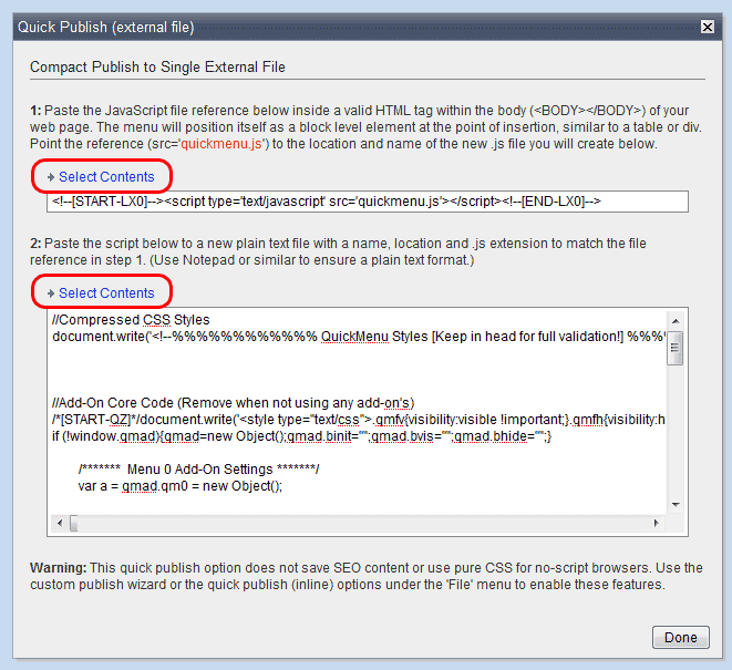
- From the File menu select Publish (manual), then Quick Publish (external).

- Publishing the menu is a two step process. First, press the upper-most Select Contents link. Copy the text. Go to your CSS Tutorial Dreamweaver site. Open any existing html file. Paste the copied code from QuickMenu into the div box that will contain the menu. Using the html files in this tutorial would result in code that appears as:
<div id="menu">

	<script type='text/javascript' src='quickmenu.js'></script>

	</div>
- Next, in QuickMenu press the lower Select Contents link. Copy the text in the second text area. Go to your CSS Tutorial Dreamweaver site. From the File menu choose New… and then select JavaScript. Press the Create button. In the code view delete any existing code. Paste the code copied in QuickMenu into this new document. Save the file with the name quickmenu.js.
- Preview the html file (not the js file) in a browser. Check to make sure that the menu functions as planned. Explanation: The code that is on the html file tells the browser to find a file named quickmenu.js and execute the code. The code on quickmenu.js produces the menu.
- In QuickMenu click the Done button.
QuickMenu is capable of making some very sophisticated menus. In this lesson you will learn how to make some more advanced changes to your menu. If, after this lesson you would like to challenge yourself, spend some time creating a stunning menu by playing around with some of the settings. Remember to save your work before experimenting. That way if things go wrong you could always just close the file without saving and then reopen the file in it original condition.
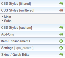
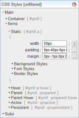
- Open the CSS Styles [unfiltered] palette. There are two areas in which to work. The Main menu and the Subs.

- Open the Main option by selecting the +Main link.
- The Container options control the box that surrounds the entire menu. We will not be changing these options.
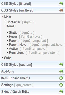
- The Items options control the appearance and function of the items in the main menu (not the drop-down items of the sub menu).
- Select the +Items link in the Main area.
 |
- The Static options control the normal appearance of the main menu items.
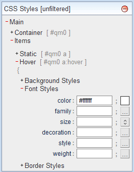
- The Hover options control the appearance of the main menu items when the mouse is hovering over the menu item.
- The Active options control the appearance of the main menu items when the mouse button is being held down over the menu item.
- The Persistent options (caution: do not use until completing the persistent State tutorial in the next lesson) control the appearance of the menu items when you are actually on that page of the site.
|
- Click on the +Static link. Let's make some changes so you can see the effects on the menu.
- Enter 50px in the width: field and then press Enter. Press OK in the dialog window that appears. Notice that the entire menu is now wider. The actual width of each item at this point is not 50px because the items also have padding. The actual width is 50px + 40px (padding-right) + 8px (padding-left) for a total width of 98px.
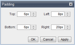
- In the padding: field notice the current values of 6px 40px 6px 8px. The order from left to right is padding-top, padding-right, padding-bottom and padding-left. (NOTE: You can press the ellipses button, ..., to the right of the padding field to edit the field or just edit the field directly and press Enter.) Change the padding-right value from the current 40px to 20px. Notice that each of the main menu items are narrower by 20px each.
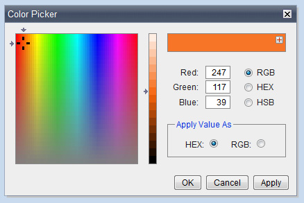
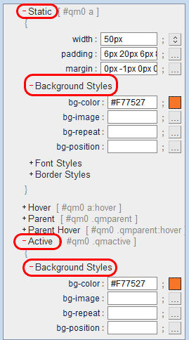
- Click on the Background Styles link. Notice the color button that indicates the current background style. Click on the color button to open a color picker window. To choose a new color first click in the rainbow window and then in the shade bar to its right. You can also enter the Red-Green-Blue (RGB) values if you know them. Press OK. Press the Cancel button so the new color is not applied to the sub menu items.

Notice the background color of the static main menu items is now the new color.

But, if you click on the Dogs main menu item you will see that the active state still has its original color.

To change the background color for the active state click on the +Active link and change the background color to match the static state's color. After making the change click on the -Active link to close that area.
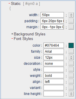
- Select the Font Styles link. In this section you can change many of the font settings.
Try the following changes:
 |
- Change the size to 12px. Press OK to allow the menu items in the sub menus to also have a font size of 12px.
- Select the color button and choose a new color (I chose Red: 7, Green:100 and Blue:100)
- Use a weight of bold

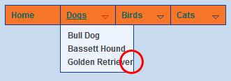
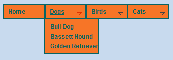
(Notice that the increase in size and weight has led to a problem in the Dogs sub menu. The issue will be addressed later)
|
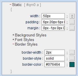
- Select the Border Styles link.
 |
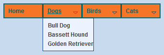
- Change the border color to match the font color.
- Change the border width to 2px. Press Cancel so the sub menu items do not inherit the border width.

|
- Close the Static area by clicking on the -Static link. Open the Hover area by clicking on the +Hover link. The Hover area settings control the look of the links when a mouse is hovering over the link.
Open the Font Styles area by clicking on the +Font Styles link.
 |
- change the font color to white: #FFFFFF. Press Cancel in the box that pops up.
- remove the decoration
- play around with some of the other active settings to see how they effect the menu but revert back to these settings when you are finished.

(notice the white text color for Home that occurs when the mouse is over that item)
|
- Close the Main, Items area by clicking on the -Items link. In this next section we will work on the sub menus.
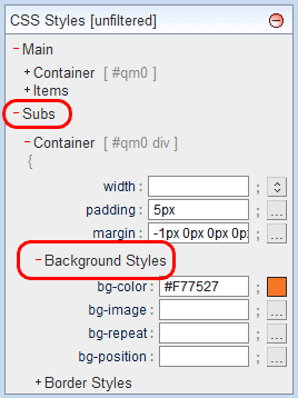
Click on the +Subs link. Click on the +Container link. Click on the +Background Styles link.
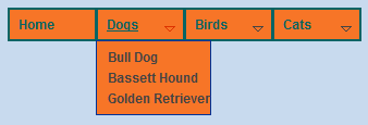
Set the background color of the sub menu item container to the same color used as the background color for the main menu items. We will leave the item's background color transparent so the container's color is visible.
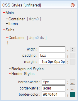
- Click on the +Border Styles link. Change the border width to 2px. Set the border color to match the color of the main menu items.
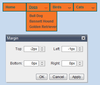
- Due to the change in border width the sub menu is 1px lower than it should be and 1px too far to the right.
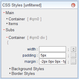
Change the sub container's margin so that the top margin is -2px and the left margin is -1px. Watch carefully, it is a minor change.
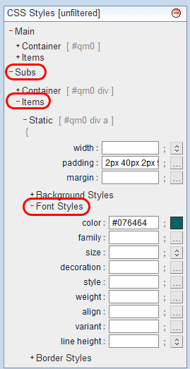
- The text color in the sub menu does not match the item color in the main menu. Click on the +Items link for the Subs.
Click on the +Font Styles link. Change the color to match the color in the main menu.
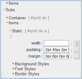
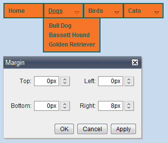
- Let's get rid of the problem that has the Golden Retriever item touching the right border of the sub. To do this we will add some right margin to the items in the subs. That will cause the items to push to the right forcing the sub container to be wider.
Change the margins to add 8px to the right.
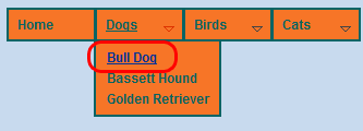
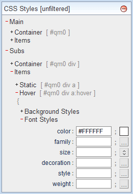
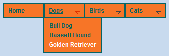
- Another issue that needs our attention is the hover color of the sub menu items. If you hover over a sub menu item you will see that the color is blue.

The main menu hover color in the is white. The hover color should be consistent so we will change the sub hover color to white.
Open the Font Styles for the Sub Items. Change the color to white. Press Cancel in the window that pops up.
Currently the decoration is underline. Underlining the items is not necessary if the item color is changing during a mouse hover. Remove underline from the decoration field. Press Cancel in the window that pops up.
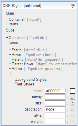
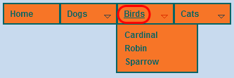
- On your menu click on the Large Cats link. Notice that the Active text color is blue and is underlined. It would look better if it was white and did not have an underline.

In the Subs Items open the Font Styles. Change the color to white (#FFFFFF) and the decoration to none.
- The Active state of the main menu items is still underlined. We need to remove the underline so it matches the rest of the menu.

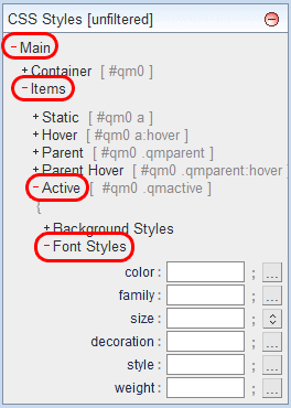
Click on Main, Items, Active, Font Styles. Remove underline from the decoration field.
- Notice the arrows that are used to indicate a sub menu. They are difficult to see and the colors are not complimentary to the other colors of the menu.

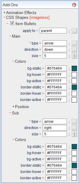
Open the Add-Ons section. Click on CSS Shapes [imageless]. Click on Item Bullets, Main, Colors. Use the colors shown in the image below.
Click on Sub, Colors. Use the colors shown in the image below.
- One last issue. Notice in the image below that Cats is green while Large Cats and Lion are white in the Active state.(Note: the mouse was hovering over the Lion link when the image was created). Cats should also be white.

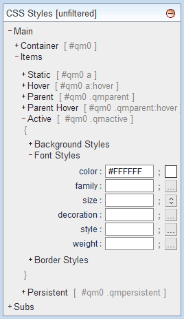
Open CSS Styles [unfiltered]. Click on the Main link. Click on the Items link, Click on the Active link. Change the color to white (#FFFFFF).
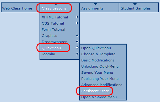
Persistent State is a term that describes the ability of the menu to reflect where the user is in the site. Notice the menu at the top of this page in the Web Design Class Site that you are in right now. The Class Lessons menu has white text while the other menus have blue text. You will also find that in the Class Lessons sub menu that the QuickMenu link is white as is the Persistent Site link. The white links show you where you are in the site.

NOTE: You will not be able to preview the effect of the Persistent State option until the menu is published.
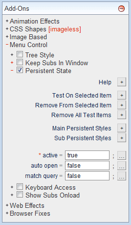
In this exercise you will be adding a persistent state that causes the menu items in the main menu and sub menus to remain white if the browser is viewing a page in the menu/sub menu. Follow the steps below to add the persistent state to your menu.
- Open the Add-Ons palette.
- Open the Menu Control section.
- Check the Persistent State checkbox.
- Change the auto open value to false.

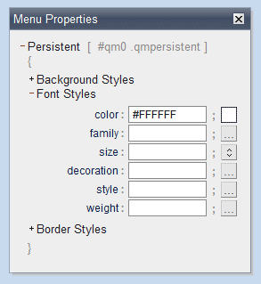
- Press the Main Persistent Styles,
 ,button. ,button.
- Click on Font Styles. Change the color to white (#FFFFFF).
Close the window.

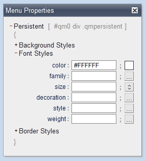
- Press the Sub Persistent Styles,
 ,button. ,button.
- Click on Font Styles. Change the color to white (#FFFFFF).
Close the window.

- Open a browser such as Internet Explorer or Firefox.
- Choose Open File... (Firefox) or Open (IE) from the File menu.
- Navigate to your web site folder.
- Open the file named menu.htm (or whatever you named the file used when saving your menu).
- Press the Visual Interface link to return to the QuickMenu program.
|
|
|


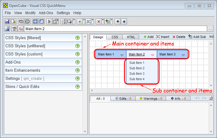 In QuickMenu terminology the Main menu is composed of the Container (the box around the menu) and the Items (the text and its surroundings in the container).
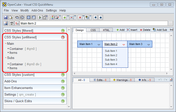 Press the Expand Section button,
  , to open the CSS Styles [unfiltered] section.
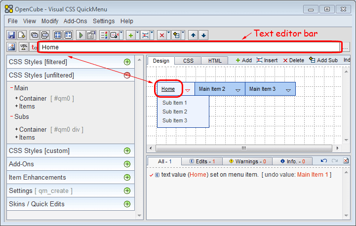
 In the sub menu below Home right-click on the menu item Sub Item 1.
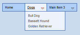
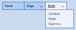

 Select the New Item menu item.
 Use what you have learned to add a sub menu to Small Cats. Add the three items Siamese, Manx and Persian in the sub menu.
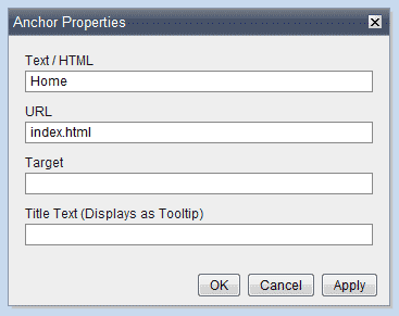 Right-click on on the Home Main menu item. Choose Edit Text/URL. Because this item is going to be the link to index.html enter index.html in the URL field. Press the OK button. NOTICE: URL stands for Uniform Resource Locator. It is a string of characters used to represent and identify a page of information on the World Wide Web.