CSS - Introduction
By following the directions found in this tutorial you will create a web site that uses Cascading Style Sheets (CSS) to give the pages the styles that govern their appearance. If you have not done so you should first complete the XHTML Basics tutorial.
According to Wikipedia: (http://en.wikipedia.org/wiki/Cascading_Style_Sheets)
"Cascading Style Sheets (CSS) is a stylesheet language used to describe the presentation of a document written in a markup language. Its most common application is to style web pages written in HTML and XHTML, but the language can be applied to any kind of XML document, including SVG and XUL.
CSS can be used locally by the readers of web pages to define colors, fonts, layout, and other aspects of document presentation. It is designed primarily to enable the separation of document content (written in HTML or a similar markup language) from document presentation (written in CSS). This separation can improve content accessibility, provide more flexibility and control in the specification of presentation characteristics, and reduce complexity and repetition in the structural content. CSS can also allow the same markup page to be presented in different styles for different rendering methods, such as on-screen, in print, by voice (when read out by a speech-based browser or screen reader) and on Braille-based, tactile devices. CSS specifies a priority scheme to determine which style rules apply if more than one rule matches against a particular element. In this so-called cascade, priorities or weights are calculated and assigned to rules, so that the results are predictable."
CSS - Initial Preparations
- The first thing we need to do is create a new web site using Dreamweaver.
- In your I: drive, create a new folder named CSS_Tutorial.
- Open the CSS_Tutorial folder you just created and create another folder named images.
- Open Dreamweaver. Press the Dreamweaver Site… button (or from the Site menu choose New Site.)
- In the Site Definition window, name the site css tutorial. Ignore the HTTP address area. Press Next.
- Choose No, I do not want to work with a server technology. Press Next.
 Choose Edit local copies on my machine… Click on the browse button (looks like a yellow folder).Navigate to the folder on the I: drive that you created in step 1. Open the folder. (due to a glitch in Dreamweaver you may need to open the images folder to get the computer to select the correct folder) Press the Select button. Press Next. Choose Edit local copies on my machine… Click on the browse button (looks like a yellow folder).Navigate to the folder on the I: drive that you created in step 1. Open the folder. (due to a glitch in Dreamweaver you may need to open the images folder to get the computer to select the correct folder) Press the Select button. Press Next.
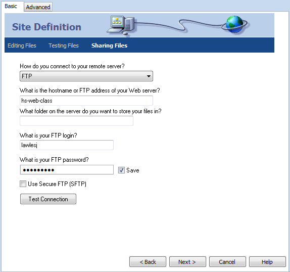 For this step see the figure on the right for reference. For this step see the figure on the right for reference.
- Choose FTP for How do you connect to your remote server?
- Enter hs-web-class for What is the host name or FTP address of your web server?
- Leave blank the entry for which folder you will use to store your files on the server.
- Enter your school login name for What is your FTP login?
- Enter your school password for What is your FTP password?
- Check the Save checkbox.
- Press the Test Connection button. If everything is set correctly you will get a message that states the connection was successful. If you get an error message check each of your entries and make sure they are correct. Ask your teacher for help if the issue can not be resolved.
- Press Next.
- Review the Summary page and press Done if everything is correct.
- The site you are creating will need some images. In J: drive/Lawless/Hand-Out folder there is a Web Design 1 folder that has a CSS Tutorial Items folder. Open the CSS Tutorial Items folder. Copy all of the images and paste them in the images folder that you created for this tutorial.
- Now that you have a site you’ll need a .html file to use as your first page. In Dreamweaver from the File menu select New. In the New Document window select HTML for the Page Type. In the Doc Type area select XHTML 1.0 Strict. Press the Create button. Save the file as index.
- You will also need a .css file. In Dreamweaver from the File menu select New. In the New Document window that appears select Blank Page and then CSS from the Page Type column. Press the Create button. Save the file as main.
- In order for your web page to be able to use the styles of the main.css file they will need to be linked. In index.html press the Code button to reveal the html code for the page. In the head section add the following line:
<link href="main.css" rel="stylesheet" type="text/css" />
So that it appears as:
<head>

	<meta http-equiv="Content-Type" content="text/html; charset=iso-8859-1" />

	<title>Untitled Document </title>

	<link href="main.css" rel="stylesheet" type="text/css" />

	</head>
- Before continuing you will need to make a change to index.html’s default code as generated by Dreamweaver. Near the top of the page replace:
<html xmlns="http://www.w3.org/1999/xhtml">
with:
<html xmlns="http://www.w3.org/1999/xhtml" xml:lang="en" lang="en">
- You are doing this now because when you are finished with your web pages you will validate the code at a web site that checks to make sure the code follows all the rules of good web design. The above code is considered as the correct code by the validating service. Validating ensures the proper display of your web pages in a browser.
CSS - Box Model
Using CSS is essentially placing boxes on a web page. You define the size, border color, width, style, etc. The box can have a background color or even a background image. Inside the box you can place text, images or even more boxes. In this lesson you will learn how to create boxes, style them and place them where you want on a web page.
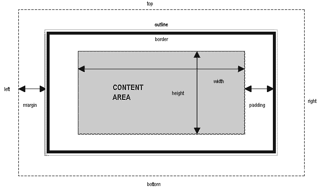
The image below represents the css box model. The total width of a box would be the sum of its width, padding, border and margin. The same would also be true of the height.
There are two types of boxes. There are the boxes that you will create from scratch and the boxes that are included as html tags. The boxes that you create from scratch will appear as either #nameOfBox or .nameOfBox. For example #myBox would be a box that you created. Likewise .myOtherBox would be a box that you created. The difference is that '#' denotes a box you wish to use only once per web page while '.' would be used for a box that you wish to use multiple times on a web page. Also, the '#' requires the use of 'id' on the web page while '.' requires 'class'. This will make a great deal more sense as you proceed through this tutorial. The default boxes are really just html tags such as <p> or <table>. Many html tags can be treated as css boxes.
Make your first box.
- In main.css write:
#box1 {width:800px; height:400px; border:1px solid #000000;}
- Save main.css
- In the code view of index.html between <body> and </body> enter:
<div id="box1"></div>
Special Note: Notice the use of id in the previous line. This is because we used # in our css description of box1.
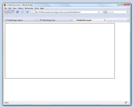 Preview the page in a browser. The box appears in the upper left hand corner of the page (or nearly so – but more on that later). Boxes by default always move up and to the left as far as they are able. Preview the page in a browser. The box appears in the upper left hand corner of the page (or nearly so – but more on that later). Boxes by default always move up and to the left as far as they are able.
- Let's make some changes to your box by adding a background color. By default the boxes are transparent. To add a red background color, add this style to the #box1 styles in main.css:
background-color:#ff0000;
so that it now appears as:
#box1 {width:800px; height:400px; border:1px solid #000000; background-color:#ff0000;}
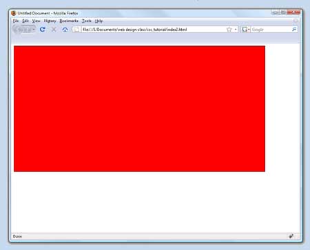 Preview the page. Preview the page.
Notice the red background.
Feel free to make other changes to the box. Change any of the styles you’ve already given the box and then view the results by previewing the page in a browser.
For example you might change the color, the border thickness, the width ot height.
- Next you will add some text to your box. In the code view of your web page, between the
<div id="box1"> and </div> enter a sentence. It will look something like:
<div id="box1">This is some text in box1.</div>
 Preview the page in a browser. Preview the page in a browser.
Notice that the text appears in the red box in its upper-left corner.
- Text should never be entered the way you just did. Text should always (or nearly so) appear within html tags designed for text. Generally, text will appear between <p> and </p> tags. As shown below add paragraph tags before and after the text that was entered previously on index.html.
<div id="box1"><p>This is some text in box1.</p></div>
- Now, let’s play with the text styles. In main.css add the following styles to our box1 styles:
color:#00FF00; font-size:32px; font-weight:bold;
so that it now appears as:
#box1 {width:800px; height:400px; border:1px solid #000000; background-color:#ff0000; color:#00FF00; font-size:32px;font-weight:bold;}
- Preview the changes in a browser. Notice that the text is in the upper left hand corner. This is because the <p></p> html tags are treated like a box. So, it moves up and to the left as far as it can go.
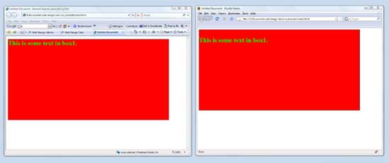 Special Notice: The browser on the left is Internet Explorer 7. The browser on the right is Firefox 3. Notice that the two browsers do not display the text in the same way. The Firefox browser displays the text farther from the top of the box than Internet Explorer. Differences between browsers cause problems for web designers. Special Notice: The browser on the left is Internet Explorer 7. The browser on the right is Firefox 3. Notice that the two browsers do not display the text in the same way. The Firefox browser displays the text farther from the top of the box than Internet Explorer. Differences between browsers cause problems for web designers.
- To further confirm that many html tags can be treated as a box, let’s add some styles for our <p> tag. In main.css add the following line:
p{border:1px solid #ffffff;}
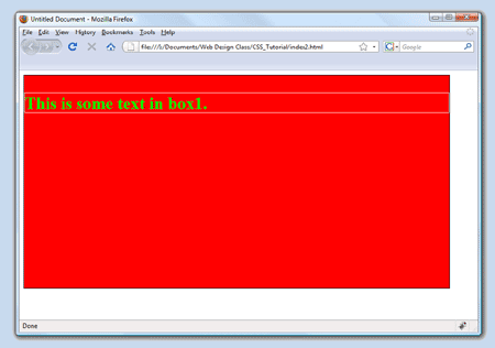 Preview the changes in a browser. Preview the changes in a browser.
Notice that the white border extends all the way across the red box. This is because we did not specify a width.
Also, notice the text is no longer completely in the corner.
- Let’s add a width style. Add the following style to the <p> tag/box:width:200px; so that it appears as
p{border:1px solid #ffffff;width:200px;}
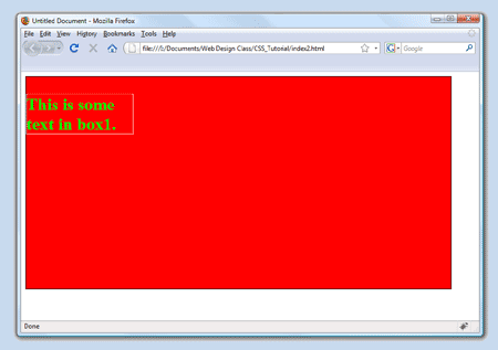 Preview the changes in a browser. Preview the changes in a browser.
Notice the width of the box has changed.
- As you should be noticing it is important that you know how to both make your own boxes and use the html tags as boxes in order to create a good looking web page. One of the most important aspects of using boxes is that they can be used for layout. This means that they are used to place page content, such as text or graphics, in the exact places that you wish them to be. The next section in this tutorial will explore layout using boxes.
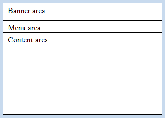 Although there is no set standard as to how a web page should appear, let's think about a typical web page. There is usually an area at the top that has some sort of a banner or company logo. Below the banner is often a menu with links to the various pages in the site. Finally, below the menu is the main content area. This is generally where all of the site’s information is placed. Although there is no set standard as to how a web page should appear, let's think about a typical web page. There is usually an area at the top that has some sort of a banner or company logo. Below the banner is often a menu with links to the various pages in the site. Finally, below the menu is the main content area. This is generally where all of the site’s information is placed.
You can think of this layout as three boxes stacked on top of each other as shown in the diagram on the right.
- As a general rule the boxes should be 800px wide. That is the width of a 15 inch monitor. Most people today have much larger monitors but when creating a web site you usually want to make sure it fits on almost everyone’s monitor.
- Let’s modify our main.css file to create the three boxes described above. Erase the old styles from the previous work in this tutorial and add the following:
#banner{width:798px; height:120px; border:1px solid #000000; background-color:#cccccc;}

	#menu{width:798px; height:30px; border:1px solid #000000; background-color:#cccccc;}

	#main{width:798px; height:400px; border:1px solid #000000; background-color:#cccccc;}
Notice: We used 798px because the borders are 1px wide, so left and right borders adds 2px to the width of the box for a total of 800px.
- In our web page, index.html, remove the code that we added between <body> and </body>. Add the following code:
<div id="banner"></div>

	<div id="menu"></div>

	<div id="main"></div>
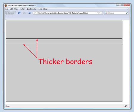 Preview the changes in a browser. Preview the changes in a browser.
Notice the thicker borders between the banner box and menu box and between the menu box and the main box. This is due to there being two borders at these places. The bottom border of the banner box is lying next to the top border of the menu box and the bottom border of the menu box lies next to the top border of the main box.
To fix this problem we’ll turn off the top and bottom border of the menu box.
- Replace the styles of the menu box with:
#menu{width:798px; height:30px; border-left:1px solid #000000; border-right:1px solid #000000; background-color:#cccccc;}
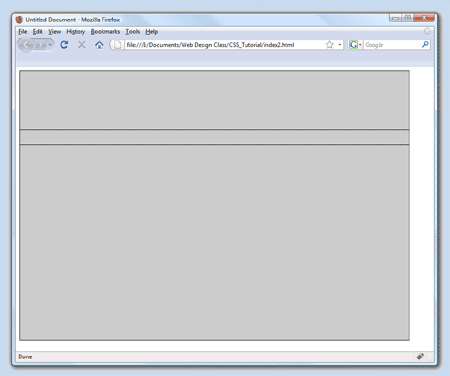 Preview the changes in a browser. Preview the changes in a browser.
Notice that the menu box now has borders only on the left and right.
Without the menu box borders on top and bottom the doubled up borders are no longer a problem.
 It was pretty easy to place three boxes on top of each other. It is a good deal trickier to place boxes inside of other boxes and have them placed exactly where you wish. It was pretty easy to place three boxes on top of each other. It is a good deal trickier to place boxes inside of other boxes and have them placed exactly where you wish.
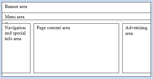
Placing boxes in other boxes is used to layout the content within the main content box. For example we may want to have a layout like the one pictured on the right.
Notice that there are three boxes laying side-by-side within the main box. By default, when you add a new box it will move up and to the left as far as possible. The navigation/info box is sitting where it is by default. The other two boxes will need to be told to ignore the default rules and follow your specific rules.
- Let’s make the three boxes shown in the image above. Add the following code to main.css:
#nav_info{width:150px; height:380px; border:1px solid #000000; background-color:#ffffff;}

	#content{width:400px; height:380px; border:1px solid #000000; background-color:#ffffff;}

	#ad_area{width:150px; height:380px; border:1px solid #000000; background-color:#ffffff;}
- Add the following code in index.html between
<div id="main"> and its </div>
so that it appears as:
<div id="main">

	<div id="nav_info"></div>

	<div id="content"></div>

	<div id="ad_area"></div>

	</div>
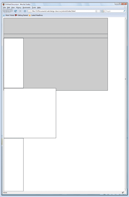 Preview the changes in a browser. Preview the changes in a browser.
What a mess.
The boxes are stacked on top of each other and they don’t all fit in the main box so they extend outside of its borders.
Proceed to the next lesson to fix these problems.
CSS - Positioning Boxes
Lesson Goal: Learn how to move boxes from their default positions to positions that are relative to their default position.
New styles: float left, position relative
- In main.css add the style float:left; to each of our three new boxes so that the styles appear as:
#nav_info{float:left; width:150px; height:380px; border:1px solid #000000; background-color:#ffffff;}

	#content{float:left; width:400px; height:380px; border:1px solid #000000; background-color:#ffffff;}

	#ad_area{float:left; width:150px; height:380px; border:1px solid #000000; background-color:#ffffff;}
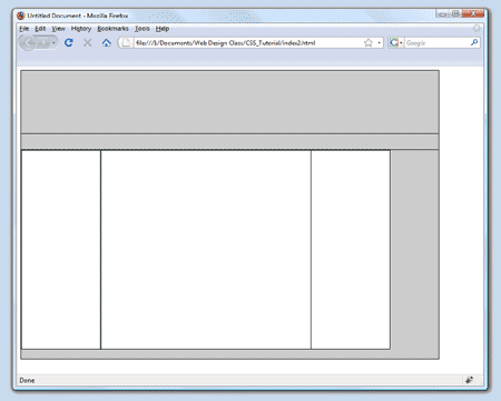 Preview the changes in a browser. Preview the changes in a browser.
Floating a box to the left removes it from the default positioning. It lets the box float up and left as far as is possible.
Because the total width of all three boxes (150px + 400px + 150px = 700px) is less than the width of the main box (798px), the boxes are able to fit side-by-side.
By the way, there is also a float right style that floats boxes up and to the right as far as possible.
- So far, so good. The boxes are side-by-side. But what if we want to separate them from each other so there is a gap between them? What if we don’t want the box all the way up to the top of the main box? Let’s move the boxes around using the position style along with top, right, bottom and left styles.
- First we’ll move the left-most box, menu_info, 10px down and 10px from the left. Add the following styles to the nav_info box:
#nav_info{float:left;width:150px; height:380px; border:1px solid #000000; background-color:#ffffff;position:relative; top:10px; left:10px;}
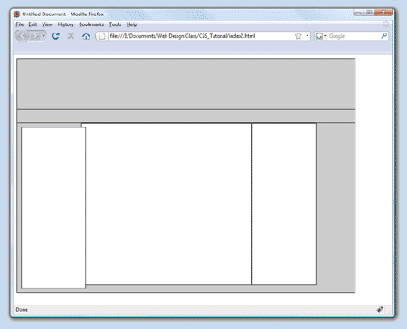 Preview the changes in a browser. Preview the changes in a browser.
Notice that the box has moved to a position 10px from the top and 10px from the left. It is overlapping the box to its right by 10px due to the move.
The position:relative style tells the browser to display the box at a place that is related (relative) to where it would appear by default but that it must move the box according to what is shown in the top and left (or top and right, or bottom and left, or bottom and right) styles.
You do not need to use top and left, you can use top, bottom, left or right individually.
- Let’s move the other two boxes so that they are not overlapping. Add the following style to the content box:
#content{float:left;width:400px; height:380px; border:1px solid #000000; background-color:#ffffff; position:relative; top:10px; left:20px;}
- Add the following style to the ad_area box:
#ad_area{float:left;width:150px; height:380px; border:1px solid #000000; background-color:#ffffff; position:relative; top:10px; left:30px;}
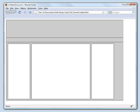 Preview the changes in a browser. Notice what has happened. The boxes have moved relative to their normal position. In this case the the first box, content, moved to a position 10px down from the top and 20px left from where it would normally appear. The second box, ad_area, moved 10px down from the top and 30px left from where it would normally appear. Preview the changes in a browser. Notice what has happened. The boxes have moved relative to their normal position. In this case the the first box, content, moved to a position 10px down from the top and 20px left from where it would normally appear. The second box, ad_area, moved 10px down from the top and 30px left from where it would normally appear.
- In main.css change the width of the content box to 452px so that there is not such a large gray area on the right side of the main box.
#content{float:left;width:452px; height:380px; border:1px solid #000000; background-color:#ffffff; position:relative; top:10px; left:20px;}
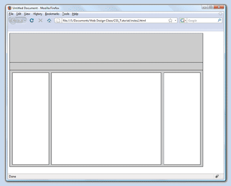 Preview the changes in a browser. Preview the changes in a browser.
Notice how well the boxes fit in the available space.
How did I know to use 452px? The main box has an inside measure of 798px. The nav_info box and ad_area have a width of 152px (inside measure plus borders) for a total of 304px. There are 4 gaps of 10px for a total of 40px. 304px + 40px = 344px. The main box has a 1px border on the right and left for a total of 2px. 344px + 2px = 346px. If we subtract the total number of pixels, 346px from the available space, 798px we get 452px.
CSS - Margins
Using CSS in Web Design
- Margins are used for pushing boxes away from each other. Boxes have margin-left, margin-right, margin-top and margin_bottom styles.
- Let’s make a new box that we will place within the nav_info box. Add the following code to main.css:
#nav_title{width:100px;height:30px; border:1px solid #000000; background-color:#999999;}
- Change the code in index.html so that the nav_title box is within the nav_info box. Your new code should appear like:
<div id="nav_info">

	<div id="nav_title"></div>

	</div>
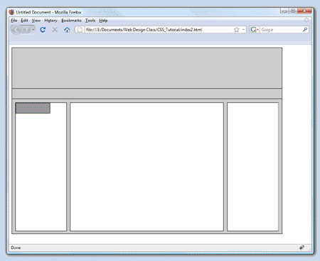 Preview the changes in a browser. Preview the changes in a browser.
You should see the nav_title box appearing as a dark gray box in the upper left corner of the nav_info box.
- Now we’ll move the new box using the margin styles. In main.css add the following styles to the nav_title box:
#nav_title{width:100px;height:30px; border:1px solid #000000; background-color:#999999; margin-top:10px;margin-left:20px;}
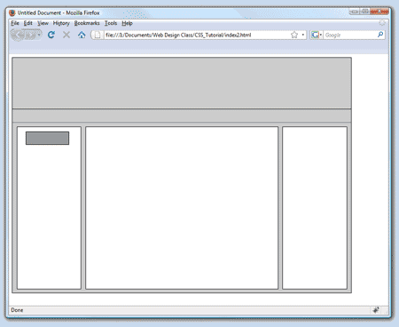 Preview the changes in a browser. Preview the changes in a browser.
The nav_title box is pushing itself 10px away from the top and 20px from the left of the box it is in.
Interestingly, you can use negative numbers with margin styles. Just for fun try using -10px for the left and top margins.
There actually are times when negative margins are useful.
Return the margin styles to their original values.
- One more thing about margins. They can be used to center boxes in a browser window. In our example the boxes are all on the left side of the screen. To center the three boxes banner, menu and main add the following code in main.css to each of their styles:
#banner{margin-left:auto; margin-right:auto; width:798px; height:120px; border:1px solid #000000; background-color:#cccccc;}

	#menu{margin-left:auto; margin-right:auto; width:798px; height:30px; border-left:1px solid #000000; border-right:1px solid #000000; background-color:#cccccc;}

	#main{margin-left:auto; margin-right:auto; width:798px; height:400px; border:1px solid #000000; background-color:#cccccc;}
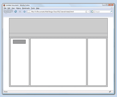 Preview the changes in a browser. Preview the changes in a browser.
The three boxes along with their contents are now centered in the browser window.
CSS - Padding
As long as we’re talking about boxes and what makes them behave the way they do, we need to talk about the padding style. Padding keeps the items in a box from getting too close to the borders of the box. But, it does so by increasing the size of the box. Let’s give it a try.
- First we need to place something in one of our boxes. Let’s put some text in the nav_title box. In the code of index.html add the following text between <div id="nav_title"> and it's </div> so that it appears as:
<div id="nav_title">INFO TITLE</div>
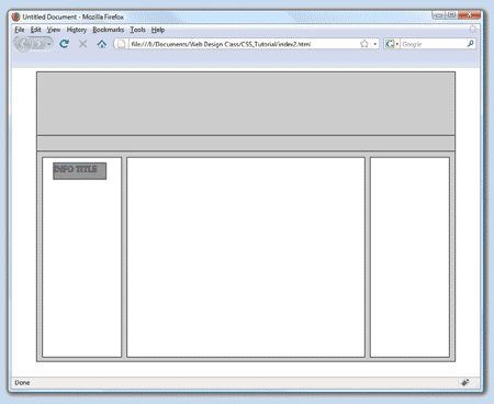 Preview the changes in a browser. Preview the changes in a browser.
Notice that the text is all the way to the left. It appears to contact the left border.
Visually this is not optimal.
- Add the following style to the nav_title box:
#nav_title{padding:4px; width:100px; height:30px; border:1px solid #000000; background-color:#999999; margin-top:10px; margin-left:20px;}
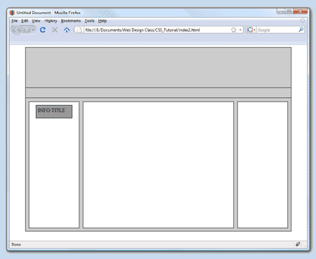 Preview the changes in a browser. Preview the changes in a browser.
You should be able to see that the nav_title box increased by 4px in each direction so that the original size of 100px by 30px is now 108px by 38px.
The reason that I want you to be aware of this behavior is that when you have precisely spaced boxes on your screen, changing the size of a box can suddenly and drastically change the layout of the entire page. When boxes don’t fit, they move to a place where they will fit. In so doing your page layout ‘breaks’. (If you’d like to see this effect in action, change the padding to 40px) You should also see that the text has moved 4px away from the left border. If there was more text you would see that it cannot come closer than 4px to any border.
You can also use padding-left, padding-top, padding-right or padding-bottom to individually set the padding for each border.
CSS - Text Styles
- Notice that the text ‘INFO TITLE’ is not centered vertically or horizontally. To fix this problems add the two following styles to the nav_title box:
#nav_title{line-height:30px; text-align:center;padding:4px; width:100px; height:30px; border:1px solid #000000; background-color:#999999; margin-top:10px; margin-left:20px;}
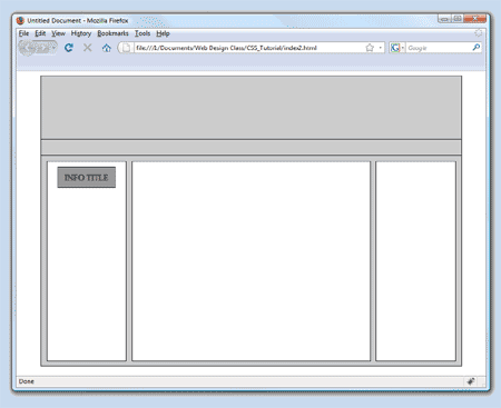 Preview the changes in a browser. Preview the changes in a browser.
The text-align:center style centers the text horizontally.
The line-height:30px causes the text to be centered vertically because the nav_title box is 30px tall, the same as the line-height.
The browser centers the text in the given height of the line it is in.
- Now we’ll add some textual content to our page. There are many styles for displaying text. The font-family, font-size, color, text-decoration, text-align and text-indent to name a few. In the following exercise steps we’ll add a box within the nav_info box and below the nav_title box.
- Add the following code to the main.css file.
#info{width:140px;height:50px;border:1px solid #000000;background-color:#999999;margin-top:6px;margin-left:4px;}
- Add the following code to the index.html file, just after the nav_title box code.
<div id="info"></div>
The body of the web page now appears as:
<body>

	<div id="banner"></div>

	<div id="menu"></div>

	<div id="main">

	<div id="nav_info">

	<div id="nav_title">INFO TITLE</div>

	<div id="info"></div>

	</div>

	<div id="content"></div>

	<div id="ad_area"></div>

	</div>

	</body>
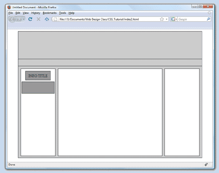 Preview the changes. Preview the changes.
Notice the new box that has appeared below the title box.
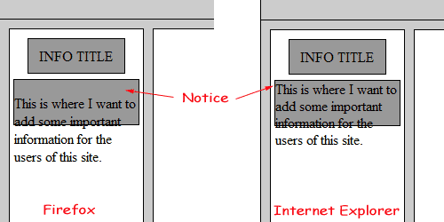 SPECIAL NOTE: You are about to discover a major frustration of web design. Not every browser follows the rules set up by the W3C, World Wide Web Consortium. SPECIAL NOTE: You are about to discover a major frustration of web design. Not every browser follows the rules set up by the W3C, World Wide Web Consortium.
Internet Explorer (IE) from Microsoft does not follow all of the rules. Because IE comes with the Windows operating system when a computer is purchased nearly everyone uses it to browse the web. Because it is so dominant Microsoft feels that they should set the rules. As you will soon see this issue causes web designers to create goofy workarounds to get their web pages to look the same in all browsers. When designing web sites you will need to check how they appear in multiple browsers. In this class we will use IE and Mozilla’s Firefox. There are others, Chrome, Opera and Safari to name a few but we don’t have them on our school computers. And, to make matters worse, even within a particular browser such as IE, older versions do not behave like newer versions. A page that looks fine in IE7 may look terrible in IE6. So, not only do you need to check your site from one browser to the next but even within different versions of a browser.
- We made the box only 50px in height. This was done so that I could demonstrate another behavior of boxes. First, we need to add some text inside the info box. Between <div id="info"> and </div> enter the following paragraph:
<div id="info"><p>This is where I want to add some important information for the users of this site.</p></div>
- Preview the changes in a browser. Notice the text is too long to fit in a box that is only 50px in height. Also notice that Firefox displays the text further down in the box than IE. In this case Firefox follows the W3C rules that tells browsers to add some margin to the top and bottom of each paragraph. IE does not follow this rule which results in the text appearing much closer to the top of the box.
- To fix this problem we are going to write our own style for <p> tags. Remember, most html tags can be treated like boxes. Enter the following code in the main.css file:
p{margin:0px;}
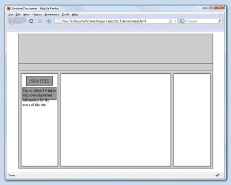 Preview the changes in a browser. Preview the changes in a browser.
Notice that the text has moved up in Firefox. There is no longer any margin at the top or bottom of the paragraph because we told the browser to ignore the default rule for <p> tags (or boxes) and follow our special rule.
- Now let’s fix the problem with the text being to long to fit in the box. We could just make the box bigger. But how big? Should we just guess? Of course the answer is no. What we should do is change the height style from 50px to auto. This will cause the box to grow as large as it needs to contain the text.
- In the main.css file change height:50px; to height:auto; for the info box.
#info{width:140px;height:auto;border:1px solid #000000;background-color:#999999;margin-top:6px;margin-left:4px;}
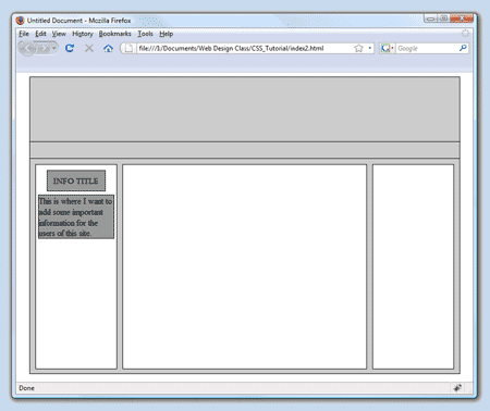 Preview the changes in a browser. Preview the changes in a browser.
Notice that the box expands to encompass all of the text.
- What happens if we add more text? In index.html copy the paragraph we entered and paste it four more times so that the code the info box appears as:
<div id="info">

	<p>This is where I want to add some important information for the users of this site.</p>

	<p>This is where I want to add some important information for the users of this site.</p>

	<p>This is where I want to add some important information for the users of this site.</p>

	<p>This is where I want to add some important information for the users of this site.</p>

	<p>This is where I want to add some important information for the users of this site.</p>

	</div>
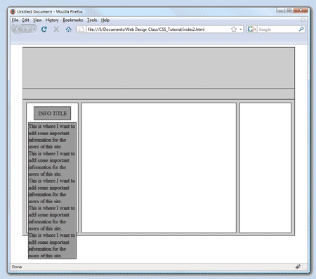 Preview the changes in a browser. Preview the changes in a browser.
Notice that the info box runs out of both the nav_info box and the main box.
- In main.css change the height of the nav_info box and the main box to auto.
#nav_info{float:left; width:150px; height:auto; border:1px solid #000000; background-color:#ffffff;}
#main{margin-left:auto; margin-right:auto; width:798px;height:auto; border:1px solid #000000; background-color:#cccccc;}
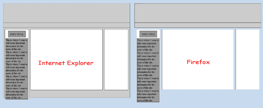 Preview the changes in both the Firefox and IE browsers. Preview the changes in both the Firefox and IE browsers.
Notice that the browsers do not handle the change the same. In Firefox the main box seems to disappear while in IE the box grows larger but not large enough.
Can you begin to see why the browser wars can cause web designers to scream?
- First, to get Firefox to extend the main box we need to add overflow:auto; to its styles. IE will ignore this style. In main.css add overflow:auto; to the main box.
#main{overflow:auto;margin-left:auto; margin-right:auto;width:798px; height:auto; border:1px solid #000000; background-color:#cccccc;}
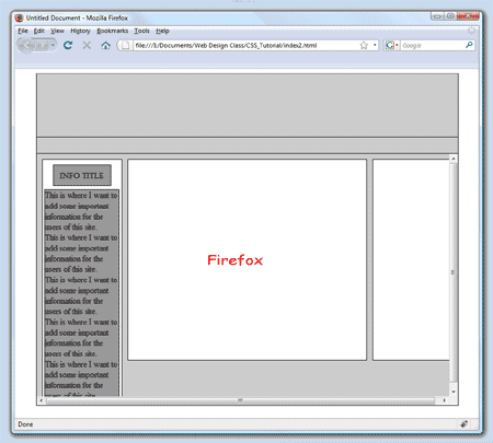 Preview the changes in both browsers. Preview the changes in both browsers.
Notice that nothing changed in IE but in Firefox the main box now extends to encompass all of the nav_info and info boxes.
However, because the nav_info and info boxes extend a little beyond the bottom of the main box there are scroll bars that appear. Clearly this is not a desired effect. IE simply lets the boxes extend below the main box. So, what happened? When we positioned the three boxes nav_info, content and ad_area we gave them a top value of 10px. In doing so the browser lets them hang down 10px farther than normal. We can fix the problem by adding padding to the bottom of the main box. This will cause the main box to extend farther down because padding causes a box to increase in size by the amount you assign. In this case we need to add at least 10px to make up for the 10px we added during positioning. We’ll add 14px so there will be a 4px gap between the nav_info box and the bottom of the main box.
- In the main.css file add padding-bottom:14px; to the main box style.
#main{padding-bottom:14px;overflow:auto;margin-left:auto; margin-right:auto;width:798px; height:auto; border:1px solid #000000; background-color:#cccccc;}
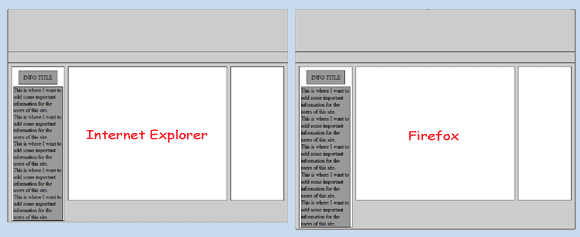 Preview the changes in both browsers. Preview the changes in both browsers.
- Now that we’ve done all that, there really should be some padding in the info box. At this point the text is touching the left side of the box. We’ll add 2px of padding. In the main.css file add padding:2px; to the info box styles.
#info{padding:2px;width:140px;height:auto;border:1px solid #000000;background-color:#999999;margin-top:6px;margin-left:4px;}
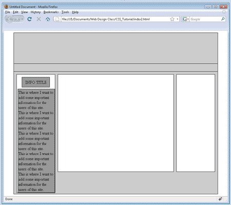 Preview the changes in a browser. Preview the changes in a browser.
Notice that the text now has a gap between it and the edges of the box.
However, the box grew in order to make that happen. Now the box is too far to the right.
We need to decrease either the left value to move the box a little to the left or decrease the width of the box. In this case we’ll decrease the width by 4px to make up for the 2px added to each side.
- In the main.css file change the width value of the info box to 136px.
#info{padding:2px;width:136px;height:auto;border:1px solid #000000;background-color:#999999;margin-top:6px;margin-left:4px;}
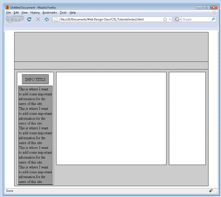 Preview the changes in a browser. Preview the changes in a browser.
- The bottom border of the info box is too close to the bottom border of the nav_info box. Add 4px of padding to the bottom of the nav_info box to create some separation.
#nav_info{padding-bottom:4px; float:left; width:150px; height:auto; border:1px solid #000000; background-color:#ffffff;}
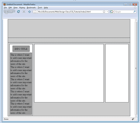 Preview the changes in a browser. Preview the changes in a browser.
- Now that the boxes look pretty good let's get back to working on the actual text found in the boxes. It is difficult at this point to see where a new paragraph begins because there is no indentation. In the main.css file add the style text-indent:10px; to the p styles so that it appears as:
p{margin:0px; text-indent:10px;}
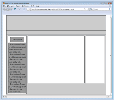 Preview the changes in a browser. Preview the changes in a browser.
- Let’s also add a little separation between the paragraphs. In the main.css file add the styles margin-top:4px; and margin-bottom:4px; to the p styles. Remove the margin:0px; style so that it appears as:
p{ text-indent:10px; margin-top:4px; margin-bottom:4px;}
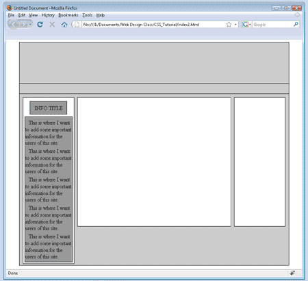 Preview the changes in a browser. Notice the new gap between paragraphs. Preview the changes in a browser. Notice the new gap between paragraphs.
- The lines of text are spaced a little too far apart from each other. We can narrow the gap using the line-height style. In the main.css file add line-height:14px; to the info box.
#info{line-height:14px;padding:2px;width:136px;height:auto;border:1px solid #000000;background-color:#999999;margin-top:6px;margin-left:4px;}
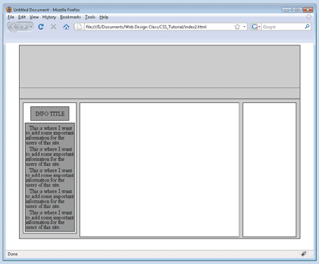 Preview the changes in a browser. Preview the changes in a browser.
Notice that the text lines appear closer together.
Truthfully this really is too close together for lines of text. You can choose other values until you find a more eye appealing value.
- Now that we’ve worked with text styles a little bit we need to ask ourselves this question. Do all of the paragraphs in the entire web site need to follow the rules we’ve given? The correct answer is 'Yes'. Well, what if we want other paragraphs in the site to follow a different set of rules? There are actually a number of ways we can solve this problem. We’ll use a method where we tell the browser to apply our paragraph styles only to those paragraphs that are located within the info box. In the main.css file add the following line after the #info line:
#info p{text-indent:10px;margin-top:4px;margin-bottom:4px;line-height:14px;}
- Preview the changes in a browser. Notice that nothing has changed. The browser still follows the rules for these paragraphs because they are in the info box. Any other paragraphs we add to our page that are not in the info box will follow the default rules of the browser. Because we want to control the appearance of the rest of the paragraphs we should create a rule for them. In the main.css file add the following:
p {margin:0px;}
- Well that worked pretty well. But, what if we wanted some of the paragraphs in the info box to have a different appearance while the others followed our info p rules? In main.css add the following: (notice the use of '.' instead of '#' between 'p' and 'special_para' Why did we do that?)
#info p.special_para{text-indent:20px; margin-top:8px; margin-bottom:8px; color:#FF0000; font-weight:bold;}
- In index.html change the code in the third paragraph of the info box so that it appears as:
<p class="special_para">This is where I want to add some important information for the users of this site.</p>
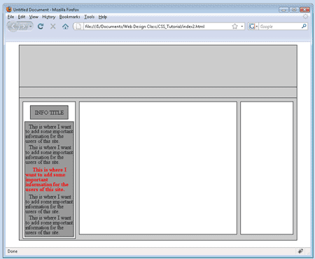 Preview the changes in a browser. Preview the changes in a browser.
Notice that the third paragraph follows the rules for the special_para style. This is because the browser sees that the third paragraph is not only in the info box but that it also belongs to the special_para rules.
So, that brings up an interesting question. When the browser sees a paragraph how does it know which rule about paragraphs to follow? So far we have three different sets of rules that deal with the appearance of paragraphs. This brings up an important point. CSS stands for Cascading Style Sheets. Cascading is a word that means to flow from one level to another. The styles in a .css document flow from the most general rule to the most specific rule. Because the special_para rules are the most specific rules assigned to that paragraph those are the rules that are followed. But, any rules that are in a more general level, such as our p{} rules will also be followed (or inherited as they say in CSS lingo) if the rule is not overridden at a more specific level. Notice that the line-height style of 14px is inherited by the special_para paragraph because it is located in the more general rule of info p that is a rule for all paragraphs in the info box.
- As a way to demonstrate the cascading behavior we will change the font-family and font-size for the entire page by writing a style that applies to the body tag. In main.css add the following:
body{font-family:Verdana, Arial, Helvetica, sans-serif;font-size:12px;background-color:#9999CC;}
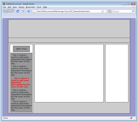 Preview the changes in a browser. Preview the changes in a browser.
Notice that the font of the paragraphs change as does the font size.
Because the body of the web page contains all of the page content the body rules are applied to everything.
Our paragraphs inherit the body rules. We can override the rule from the body if we change the font-family or font-size to something different in any box that is closer to the level of our paragraphs.
CSS - Image Styles
It’s time to work with images.
Images can be added to either the background of a box or in the foreground. If the graphic is in the background, text and even other graphics can be added on top of the graphic in the foreground. If a graphic is in the foreground you cannot place text or anything else on top of it. Also, when a graphic is placed in the background of a box, it will tile itself (repeat) both horizontally and vertically as many times as possible to fill the available space.
- First, let’s add a small picture to the background of our ad_area box. Remember that we have an image in our images folder named 'small_smiley'. In main.css add the following style to the ad_area box:
#ad_area{background-image:url(images/small_smiley.jpg);float:left;width:150px; height:380px; border:1px solid #000000; background-color:#ffffff; position:relative; top:10px; left:30px;}
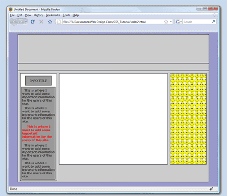 Preview the changes in a browser. Preview the changes in a browser.
Notice the image is tiled to fill the entire background area of the box.
- What if you did not want the image to repeat? In main.css add the following style to the ad_area box:
#ad_area{background-repeat:no-repeat;background-image:url(images/small_smiley.jpg);float:left;width:150px; height:380px; border:1px solid #000000; background-color:#ffffff; position:relative; top:10px; left:30px;}
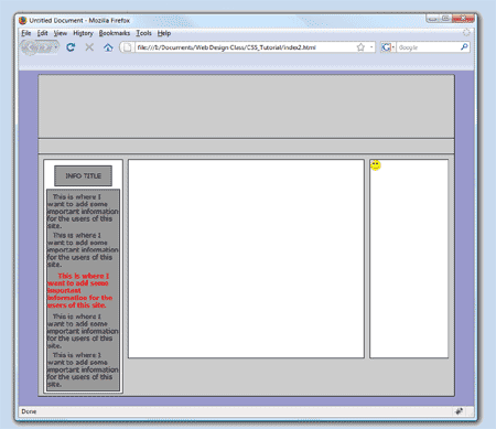 Preview the changes in a browser. Preview the changes in a browser.
Notice the image does not repeat.
- What if you wanted to repeat the image only vertically? In main.css change the background-repeat value to from no-repeat to repeat-y.
#ad_area{background-repeat:repeat-y; background-image:url(images/small_smiley.jpg);float:left;width:150px; height:380px; border:1px solid #000000; background-color:#ffffff; position:relative; top:10px; left:30px;}
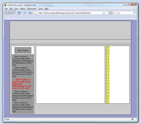 Preview the changes in a browser. Preview the changes in a browser.
- Try changing the repeat-y to repeat-x.
#ad_area{background-repeat:repeat-x; background-image:url(images/small_smiley.jpg);float:left;width:150px; height:380px; border:1px solid #000000; background-color:#ffffff; position:relative; top:10px; left:30px;}
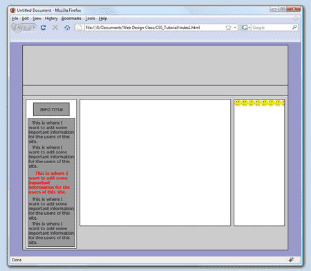 Preview the changes in a browser. Preview the changes in a browser.
- Return the background-repeat to background-repeat:no-repeat;
#ad_area{background-repeat:no-repeat; background-image:url(images/small_smiley.jpg);float:left;width:150px; height:380px; border:1px solid #000000; background-color:#ffffff; position:relative; top:10px; left:30px;}
- Let’s learn to position a background image. There is more than one way to position a background image. In main.css add the following code to the ad_area box:
#ad_area{background-position:center; background-repeat:no-repeat; background-image:url(images/small_smiley.jpg);float:left;width:150px; height:380px; border:1px solid #000000; background-color:#ffffff; position:relative; top:10px; left:30px;}
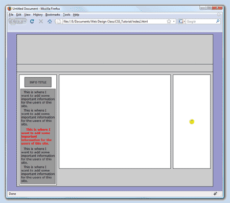 Preview the changes in a browser. Preview the changes in a browser.
Note that you can also use: top left, top center, top right, center left, center right, bottom left, bottom center or bottom right to position the image.
You can also use percentage values or pixels to position the background image.
For example: background-position: 50px 100px; would position the image 50px from the left side of the box and 100px down from the top of the box. With percentage values, background-position: 50% 50%; would place the image half-way across the box horizontally and half-way vertically.
- Now let’s add a background image to the banner area at the top of our web page. Remember that the banner is 798px wide and 120px tall. The image we’ll use will need to be the same size. There is an image, banner.jpg, in your site's images folder that is an image already prepared for this step. In main.css add to the banner box the following:
#banner{background-image:url(images/banner.jpg);background-repeat:no-repeat; margin-left:auto; margin-right:auto; width:798px; height:120px; border:1px solid #000000; background-color:#cccccc;}
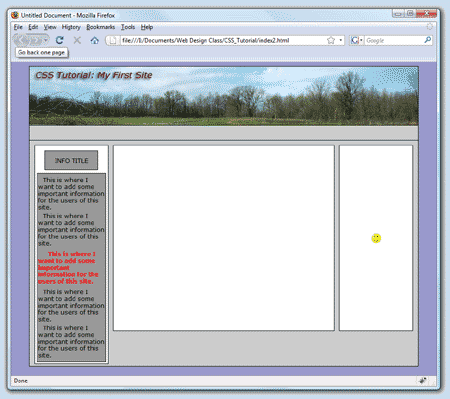 Preview the changes in a browser. Preview the changes in a browser.
- We’ve worked with images in the background. Now we’ll work with images in the foreground. The foreground is where text and images are generally placed in a box. For this section of the tutorial we will be creating boxes that contain information about dogs. These boxes will be located in the content box. In main.css add:
.dog_info{width:400px;height:auto;background-color:#999999;border:1px solid #000000;margin-left:auto;margin-right:auto;padding:4px;}
- In index.html between
<div id="content"> and </div> add:
<div class="dog_info"></div>
So that it appears as:
<div id="content">

	<div class="dog_info"></div>

	</div>
Special Note: Notice that we used the ‘.’ and not the ‘#’ when creating our dog_info box. Also notice that we had to use "class" instead of "id" in the code: <div class="dog_info"> When you have a box that will be used more than once on a web page you should use the ‘.’ and not the ‘#’, “class” and not “id”.
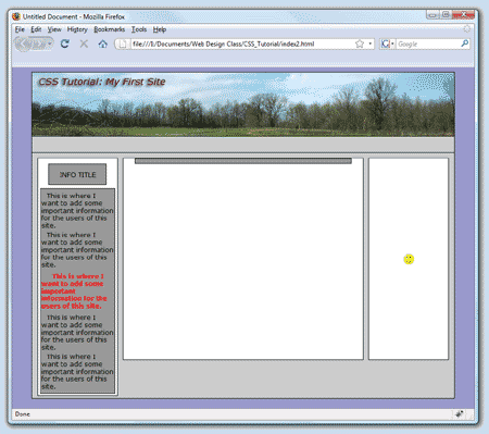 Preview the changes in a browser. Preview the changes in a browser.
Because the height style is set to auto and the dog_info box does not have any content yet it appears quite small in height.
- In index.html between
<div class="dog_info"> and </div> add:
<img src="images/bulldog.jpg" />
Followed by:
<p>American Bulldog</p>
Followed by:
<p>The American Bulldog remains higher on the leg, more agile and swifter than its English counterpart. Some individuals are reportedly able to leap six or more feet into the air. The American Bulldog is a very muscular, sturdy dog with a large, powerful head and jaws. He is very strong, but agile and light on his feet. The chest is wide and the muscular neck tapers from shoulders to head. The neck may have a slight dewlap. The head is square and broad with muscular cheeks and a furrow between the rounded eyes. The strong muzzle is shaped like a box.</p>
So that it appears as:
<div class="dog_info">

	<img src="images/bulldog.jpg" />

	<p>American Bulldog</p>

	<p>The American Bulldog remains higher on the leg, more…</p>

	</div>
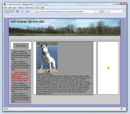 Preview the changes in a browser. Preview the changes in a browser.
Notice that the three items (an image and two paragraphs) in our dog_info box are stacked on top of each other in the order we entered them.
This does not result in a very nice appearance.
- To make this look better we can simply have the image floated to the right. So, we will need to add some styles to the images that are within our dog_info box. In main.css add the following:
.dog_info img{float:right;border:1px solid #000000;margin-left:4px;}
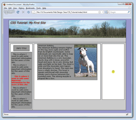 Preview the changes in a browser. Preview the changes in a browser.
Notice that the image is now moved to the right and the text fills the space on the left.
Also notice that a border was added to the image and the text is not allowed to be closer than 4px to its left side.
- The title ‘American Bulldog’ would look better if it stood out from the main text. Because this would be true of each title for the rest of the dogs to be placed on this page we will create a style just for the titles. In main.css add:
.dog_title{text-align:center; font-weight:bold; margin-bottom:4px;}
- In index.html change:
<p>American Bulldog</p>
to:
<p class="dog_title">American Bulldog</p>
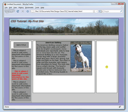 Preview the changes in a browser. Preview the changes in a browser.
- Now let’s add the information for two more dogs. Add the following code after the closing div, </div>, of the first dog_info box:
<div class="dog_info">

	<img src="images/basset.jpg" />

	<p class="dog_title">Basset Hound</p>

	<p>The head is large, with a rounded skull and pronounced occiput. The plane of the muzzle is parallel to the top of the skull. The skin is loose-fitted and falls in folds on the head. The velvety ears are very long and should meet beyond the top of the nose. They should fold and not appear flat. The large teeth should meet in a scissors or level bite. The lips hand down with loose flews. The sad brown eyes should show prominent haw. The expression should be kindly without any harshness.</p>

	</div>

	<div class="dog_info">

	<img src="images/golden_retriever.jpg" />

	<p class="dog_title">Golden Retriever</p>

	<p>The Golden Retriever is a beautiful, sturdy, well-proportioned dog with a feathered, medium-length, cream to golden-colored coat. (The coat is not suppose to be red.) The outer coat is water-repellent and the undercoat is dense. The head is broad, with a tapering, but wide, powerful muzzle. It has a scissors bite and a clear frontal stop. The nose is black and the kindly eyes are brown with dark rims. The ears are medium-sized and pendant. Its neck and thighs are muscular and the chest is broad. The tail is long, but never curled.</p>

	</div>
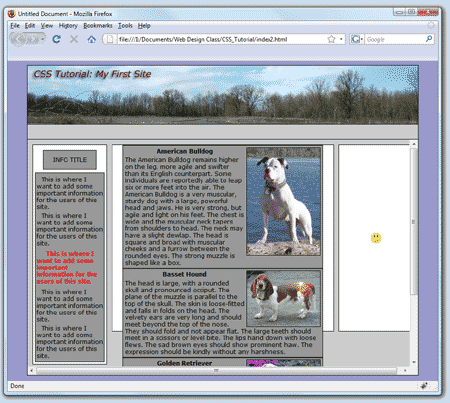 Preview the changes in a browser. Preview the changes in a browser.
Notice that the amount of content we’ve added is too much to fit in the content box.
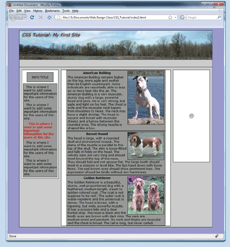 Go to main.css and change the height value of the content box from 380px to auto. Go to main.css and change the height value of the content box from 380px to auto.
Preview the changes in a browser. Notice how both the content box and main box expand vertically. Also notice that the last dog_info box is touching the bottom of the content box.
- Let’s add some padding to the bottom of the content box. In main.css add the following to the content box styles:
#content{padding-bottom:10px; float:left;width:400px; height:auto; border:1px solid #000000; background-color:#ffffff; position:relative; top:10px; left:20px;}
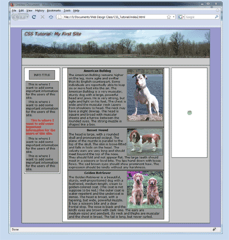 Preview the changes in a browser. Preview the changes in a browser.
Now there is a nice gap between the last dog_info box and the content box's bottom border.
Also, notice that each of the dog_info boxes are touching each other.
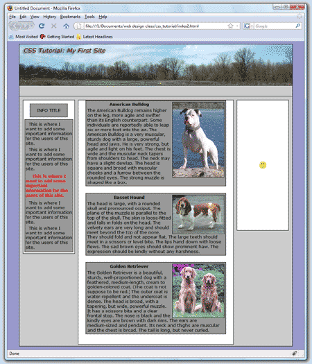
- Add some margin-bottom to get some separation. In main.css add margin-bottom:20px; to the dog_info box styles.
.dog_info{margin-bottom:20px;width:400px;height:auto;background-color:#999999;border:1px solid #000000;margin-left:auto;margin-right:auto;padding:4px;}
 Preview the changes in a browser. Preview the changes in a browser.
Notice the separation between the dog_info boxes. Also, notice that the first dog_info box touches the top border of the content box.
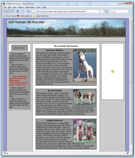
- In order to move the first dog_info box away from the top of the content box we will add some text. In index.html add the following paragraph before the first dog_info box:
<p class="title">My Favorite Dog Breeds<p>
- In main.css add the following style:
.title{text-align:center;margin-top:10px; margin-bottom:10px; margin-left:auto; margin-right:auto; font-weight:bold}
 Preview the changes in a browser. Preview the changes in a browser.
CSS - Links/Menu Styling
http://www.mcfarland.k12.wi.us/schools/high/WebDesign1
No web site would be complete without a menu. When using links to get from one place to another in your site you are navigating through the site. Often menus are referred to as nav bars. We will be building our menu in the menu box that we created earlier in this tutorial.
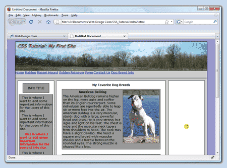
- First we will need to add the links. In index.html inside of the menu box add the following code so it appears as:
<div id="menu">

	<a href="index.html">Home</a>

	<a href="bulldog.html">Bulldog</a>

	<a href="basset_hound.html">Basset Hound</a>

	<a href="golden_retriever.html">Golden Retriever</a>

	<a href="form.html">Form</a>

	<a href="mailto:rover@weluvdogs.net">Contact Us</a>

	<a href="http://www.dogbreedinfo.com">Dog Breed Info</a>

	</div>
 Preview the changes in a browser. Preview the changes in a browser.
Notice that the links are not stacked vertically but instead are following each other horizontally. Elements like boxes are stacked vertically. This is called a block display style. Other elements such as links are aligned horizontally. This is called an inline display style. Because we want our menu to be horizontal this works well. We could change the display style to block if we wanted our menu to be vertical.
Also notice that the links are colored blue and are underlined. This is the default style for links.
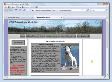
- At this point the links don’t really look very appealing. Sitting on the left side of the menu is just the default position. We may want to center them or move them to a more appealing position. As always we will accomplish these changes using styles. In main.css add the following:
a{position:relative;top:3px;left:100px;margin-right:4px; float:left;text-decoration:none;border:1px solid #000000;background-color:#999999;padding:2px; color:#000000;font-size:14px;line-height:18px;}
 Preview the changes in a browser. Preview the changes in a browser.
Look at the styles that we added. Check to make sure that you understand what each style did to change the appearance of the links.
- Let the mouse hover over one of the links. Notice that nothing happens except that the cursor changes to a hand. Generally you would like to give the user a visual cue to makes it obvious that they are over a link. In main.css add the following:
a:hover{background-color:#66CCFF;}
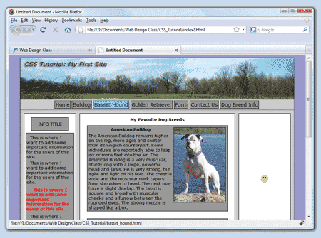 Preview the changes in a browser. Preview the changes in a browser.
Notice that the background of the link changes color when the mouse is hovering over it.
- It will not do us any good to make a menu if we don’t have anywhere to go. We will need to add some pages to our site. In order to take as little time as necessary we will duplicate the page we’ve already made four times and then modify each page slightly.
- On the right side of the screen in Dreamweaver right-click on the index.html file in the Files window. Choose Edit and then Duplicate. Notice that the computer makes a copy of the index.html file.
- Repeat this three more times.
- Rename the four new files to bulldog.html, basset_hound.html, golden_retriever.html and form.html.
- Open the file bulldog.html and remove from the code the dog_info boxes for the Basset Hound and the Golden Retriever. In the <head> section of the web page change the title from
<title>Untitled Document</title> to the code shown below. Save the file.<title>Bulldog</title>
- Open the file basset_hound.html and remove from the code the dog_info boxes for the Bulldog and the Golden Retriever. In the <head> section of the web page change the title from
<title>Untitled Document</title> to the code shown below. Save the file. <title>Basset Hound</title>
- Open the file golden_retriever.html and remove from the code the dog_info boxes for the Basset Hound and the Bulldog. In the <head> section of the web page change the title from
<title>Untitled Document</title> to the code shown below. Save the file. <title>Golden Retriever</title>
- In the file index.html change the title from
<title>Untitled Document</title> to the code shown below . Save the file.<title>CSS Tutorial - Home</title>
- In the file form.html remove all of the dog_info boxes. Change the title from
<title>Untitled Document</title> to the code shown below. Save the file.<title>CSS Tutorial - Form</title>
- Preview the changes in a browser. Check the links to make sure they are correctly linked to their pages. It is considered to be good practice to give the user a visual hint about which menu they selected. For example, after clicking the Bulldog link, the user arrives at the bulldog.html and the Bulldog link remains blue in the background. In main.css add the following:
.visual_aid{background-color:#66CCFF;}
- In bulldog.html change:
<a href="bulldog.html">Bulldog</a> to <a class="visual_aid" href="bulldog.html">Bulldog</a>
- In basset_hound.html change:
<a href="basset_hound.html">Basset Hound</a> to <a class="visual_aid" href="basset_hound.html">Basset Hound</a>
- In golden_retriever.html change:
<a href="golden_retriever.html">Golden Retriever</a> to
<a class="visual_aid" href="golden_retriever.html">Golden Retriever</a>
- In form.html change:
<a href="form.html">Form</a> to <a class="visual_aid" href="form.html">Form</a>
- In index.html change:
<a href="index.html">Home</a> to <a class="visual_aid" href="index.html">Home</a>
- Preview the changes in a browser. Notice that when you are on a page in the site that the menu item for the page you are on remains blue in the background.
- Open the file index.html. There is a box, ad_area on the right side of the page that was set aside for advertising. We will add a few images to that area and then link them to their web sites.
- First, in the code view of index.html press the Enter key to create some space between
<div id="ad_area"> and </div> so it appears like:
<div id="ad_area">


	</div>
- Next add the following code to the ad_area: (notice: these four lines of code will also need be added into the ad_area box of the pages basset_hound.html, bulldog.html, golden_retriever.html and form.html)
<div id="ad_area">

	<p>Please visit our sponsors.</p>

	<img src="images/ad_dog.jpg" alt="dog.com image" />

	<img src="images/ad_ohMyDog.jpg" alt="ohmydogsupplies.com image" />

	<img src="images/ad_petCareRX.jpg" alt="petcarerx.com image" />

	</div>
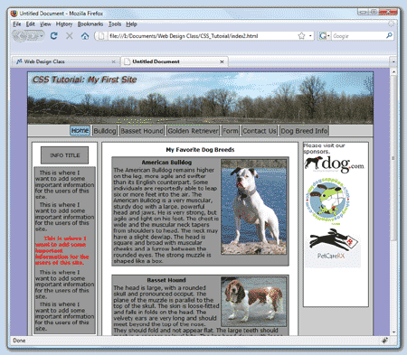 Preview the file index.html in a browser. Preview the file index.html in a browser.
Notice the text and images that appear in the ad_area box.
- In the main.css file add the following:
#ad_area img{border:1px solid #000000; margin-bottom:10px; margin-top:10px;}
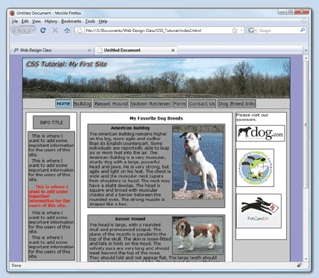 Preview the file index.html in a browser. Preview the file index.html in a browser.
Notice the borders on the images and the separation due to the margin styles.
- In main.css change the #ad_area code so that the height is now:
height:auto; If there is a background image and background repeat style in the ad_area remove them. Also, add these new styles: padding-top:10px;text-align:center;
The #ad_area styles should now look like:
#ad_area{padding-top:10px;text-align:center;float:left;width:150px; height auto; border:1px solid #000000; background-color:#ffffff; position:relative; top:10px; left:30px;}
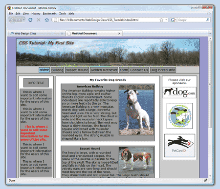 Preview the file index.html in a browser. Preview the file index.html in a browser.
Notice that the images are now centered and the text has been pushed down from the top.
- Now lets add the link, <a> , tags around to the image, <img />, tags. In index.html change the image code so that it appears as: (notice that the existing image tags are highlighted green while the surrounding anchor tags are highlighted mustard yellow)
<a href="http://www.dog.com"><img src="images/ad_dog.jpg" alt="dog.com logo" /></a>

	<a href="http://www.ohmydogsupplies.com"><img src="images/ad_ohMyDog.jpg" alt="ohmydogsupplies.com logo" /></a>

	<a href="http://www.petcarerx.com"><img src="images/ad_petCareRX.jpg" alt="petcarerx.com logo" /></a>
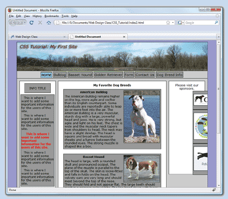 Preview the file index.html in a browser. Preview the file index.html in a browser.
OUCH! Where did the images go? Try scrolling to the right. Hmmm. That is not what we would like to see happening to our web page.
Here's what happened. The images are now links and as such they must follow the rules that are set up for links. The menu we created at the top of each page is made of links. We styled the links to look nice in our menu. Now however we have other links and those styles do not look good for them. How can we fix this problem? We will edit the main.css file so that only the links in the menu box follow the link styles we made for the menu.
- In main.css change these lines:
a{position:relative;top:3px;left:100px;margin-right:4px; float:left;text-decoration:none;border:1px solid #000000;background-color:#999999;padding:2px; color:#000000;font-size:14px;line-height:18px;}
a:hover{background-color:#66CCFF;}
.visual_aid {background-color:#66CCFF;}
to: (notice you are just adding #menu before each line)
#menu a{position:relative;top:3px;left:100px;margin-right:4px; float:left;text-decoration:none;border:1px solid #000000;background-color:#999999;padding:2px; color:#000000;font-size:14px;line-height:18px;}
#menu a:hover{background-color:#66CCFF;}
#menu .visual_aid {background-color:#66CCFF;}
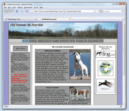 Preview the file index.html in a browser. Preview the file index.html in a browser.
Wow, now that's more like it. Why did that help?
By placing #menu at the beginning of the code the link styles only apply to links found inside of the menu box.
Links outside of the menu box do not follow those styles.
CSS Tutorial - Finishing Touches
Final Touches
The web site is nearly finished. The first page, index.html has information about all three dogs but it shouldn't. Instead, we will place a nice picture of dogs on the front page of the site.
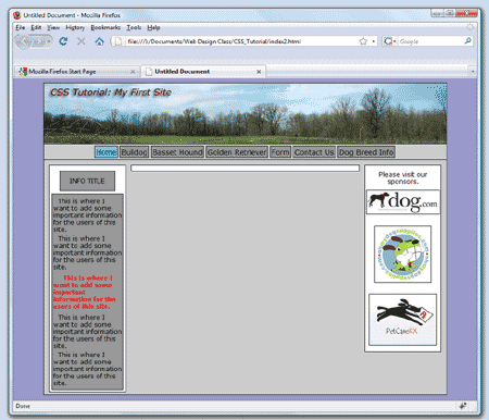 In index.html erase the code in the content box for the three dog_info boxes and the title paragraph. In index.html erase the code in the content box for the three dog_info boxes and the title paragraph.
Preview the changes in a browser.
Notice that the content box is now empty.
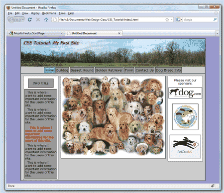 Add the image 'dog_collage.jpg' to the content box of index.html. Add the image 'dog_collage.jpg' to the content box of index.html.
Preview the changes in a browser.
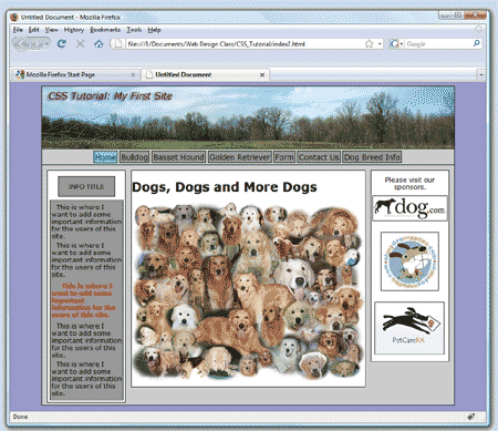 Add the text "Dogs, Dogs and More Dogs" in an <h1> tag above the dog_collage image in index.html. Add the text "Dogs, Dogs and More Dogs" in an <h1> tag above the dog_collage image in index.html.
Preview the changes in a browser.
- In main.css center the text by adding a text-align:center style to the h1 tags. The code will appear as:
h1{text-align:center;}
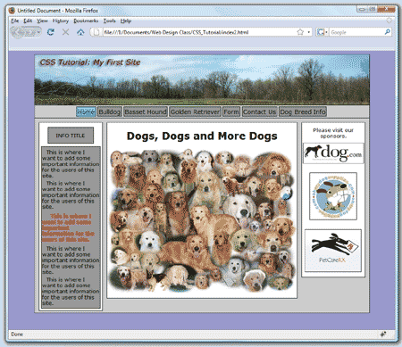 Preview the changes in a browser. Preview the changes in a browser.
Notice that the text is now centered.
- Finally, you may have noticed at some point during this tutorial that in the upper-left corner of the web browser are the words "Untitled Document". The title also appears on a tab if more than one site is open in the browser. Go to each html page in your web site and look in the <head> section to find the <title> tag. Change the default title to something appropriate. For example, the title of the index.html page might be "All About Dogs - Welcome". Likewise the title for the page with Bulldog information might be "All About Dogs - American Bulldog".
CSS - XHTML Validation
The final step of making a web page is validating the code to make sure that you have followed all of the rules that govern how the browser will display the page. To validate the code on your page follow these steps:
- Copy all of the code on your page.
- Go to http://validator.w3.org/#validate_by_input
- Paste your code into the text area provided.
- Press the check button.
If your code validates you will get a message stating ‘This document was successfully checked as XHTML 1.0 Strict!’.
If your code does not validate you will see the message 'Error found while checking this document as XHTML 1.0 Strict!’.
If you fail validation (and surely you will the first time!) then scroll down to find a list of your errors. Don’t worry if there seems to be a lot of errors. Sometimes one missing ‘/’ can cause the validation tool to register more than one error.
Fix each of the errors and then try to validate the code again. Repeat until your code validates.
CSS - CSS Validation
You should also make sure that the CSS you are using can be validated.
To validate the CSS from your main.css file follow these steps:
- Copy all of the code in main.css.
- Go to http://jigsaw.w3.org/css-validator/#validate_by_input
- Paste your code into the text area provided.
- Press the check button.
If your code validates you will get a message stating 'Congratulations! No Error Found'.
If your code does not validate you will see the message 'Sorry! We found the following errors(1)', followed by a list of the errors.
To validate your code you will need to fix the errors and repeat the testing procedure.
Important: After finishing this section proceed to the Form Tutorial where you will create a web form for form.html, the final page of the tutorial site.
|
|
|

 Choose Edit local copies on my machine… Click on the browse button (looks like a yellow folder).Navigate to the folder on the I: drive that you created in step 1. Open the folder. (due to a glitch in Dreamweaver you may need to open the images folder to get the computer to select the correct folder) Press the Select button. Press Next.

 Preview the page in a browser. The box appears in the upper left hand corner of the page (or nearly so – but more on that later). Boxes by default always move up and to the left as far as they are able.
 Preview the page in a browser.
 Special Notice: The browser on the left is Internet Explorer 7. The browser on the right is Firefox 3. Notice that the two browsers do not display the text in the same way. The Firefox browser displays the text farther from the top of the box than Internet Explorer. Differences between browsers cause problems for web designers.
 Preview the changes in a browser.
 Although there is no set standard as to how a web page should appear, let's think about a typical web page. There is usually an area at the top that has some sort of a banner or company logo. Below the banner is often a menu with links to the various pages in the site. Finally, below the menu is the main content area. This is generally where all of the site’s information is placed.
 Preview the changes in a browser.
 Preview the changes in a browser.
 It was pretty easy to place three boxes on top of each other. It is a good deal trickier to place boxes inside of other boxes and have them placed exactly where you wish.


 Preview the changes in a browser.
 Preview the changes in a browser.
 Preview the changes in a browser.
 Preview the changes in a browser.

 Preview the changes in a browser.
 Preview the changes in a browser.

 Preview the changes in both browsers.
 Preview the changes in both browsers.
 Preview the changes in a browser.
 Preview the changes in a browser.
 Preview the changes in a browser.
 Preview the changes in a browser.
 Preview the changes in a browser. Notice the new gap between paragraphs.

 Preview the changes in a browser.
 Preview the changes in a browser.
 Preview the changes in a browser.
 Preview the changes in a browser.
 Preview the changes in a browser
 Preview the changes in a browser.
 Preview the changes in a browser.

 Preview the changes in a browser.
 Preview the changes in a browser.

 Preview the changes in a browser.
 Preview the changes in a browser.
 Preview the changes in a browser.
 Preview the changes in a browser.
 Preview the changes in a browser.
 Preview the file index.html in a browser.
 Preview the file index.html in a browser.
 Preview the file index.html in a browser.
 Preview the file index.html in a browser.
 In index.html erase the code in the content box for the three dog_info boxes and the title paragraph.

 Preview the changes in a browser.